Thursday 20 November 2014
Research and planning: name decisions
We have decided on a film name, we decided to call our film "We Meet Again" because we think it goes well with our storyline and sounds creepy. I have named my magazine "Showcase" because I think it's suitable and could cover a wide range of audiences.
Research and planning: film name idea feedback
This is a picture showing the sheets that me and my group used to get feedback on our film name. Three of them told us to call our film Captured and two said Isolation but as a group we decided that we were going to go against the feedback because we feel that the film is better suited to the name "We Meet Again".
Monday 17 November 2014
Research and planning: audition poster
This is an audition poster that I made for me and my group to post around college so that people come to use for auditions for the trailer which will help us to get actors.
Sunday 16 November 2014
Research and planning: publication plan
This is my publication plan. It goes into more detail about my magazine and explains things such as where it will be distributed and how much it will cost.
Saturday 15 November 2014
Research and planning: initial masthead ideas
This post shows masthead ideas that I have come up with for my magazine. I plan to show them in more detail through photoshop, showing both colour and style. The ideas I have are:
- Showcase
- Exclusive
- Preview
Friday 14 November 2014
Research and planning: film name ideas
As a group, we came up with a few name ideas that we thought were strong and had potential to be our film name. They were;
- Isolation
- We Meet Again
- Captured
Together we think that We Meet Again is the strongest but we are going to get some audience feedback and then decide on a final film name.
Thursday 13 November 2014
Research and planning: film magazine analysis 2
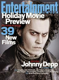
Again, I can tell right away that this is a film magazine. This is because of the cover lines that are used and the language in them. More specifically I can tell that this magazine is based on a horror film because of the picture, which is Sweeney Todd, the character helps portray the horror image because of the make up and costume. However the colours used don't represent the usual horror look, they portray a more cold image, with the white and blue font and the character is also pale. The audience for this magazine would also be very wide because it will have the audience of people who like to read film magazines, then people who like Sweeney Todd but also people who are Johnny Depp fans. This is the type of thing I need to do when I create my magazine rather than sticking to a small audience. The language used "Holiday Movie Preview" "39 New Films" are very specific to the movie magazine genre.
Research and planning: film magazine analysis 1
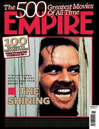
This magazine is clearly a film magazine. I can tell this because it says "The 500 Greatest Movies Of All Time" and it also has a picture from a well known movie scene on the front. I can tell this magazine is based on horror because of the film displayed, which is The Shining. The colours used also represent the stereotypical horror look. The audience for this film would be people interested in both horror films and films in general. That makes the audience very wide. On the front of the magazine we can see the cover line saying the title of the film, along with a cover line above that is bold "100 covers to choose from" this will appeal to a wide range of audiences; this is what I need to think about when designing my own magazine cover
Research and planning: plan for the week
There are some tasks that I must get done this week. They are;
- 2 film magazine analysis'
- 2 film magazine draft ideas
- progression on animatic story board
- publication plan
Sunday 9 November 2014
Research and planning: film poster draft 2
This is the second draft idea that came up with for my movie poster, again, it has the title "We Meet Again" and the tagline. The poster shows a hint towards where the trailer is set (the farmhouse), This draft also includes the ghost / villain, introducing the audience to that character early. This is because horror films are often similar, they have a group of people and a villain which changes. So I decided I wanted to show the ghost early.
Research and planning: film poster draft 1
This is a draft of a film poster that I hope to create to go with my trailer. It shows an idea of the type of image I'd use (medium close up). It shows the title idea (We Meet Again) and the tagline. From this draft you also get an idea of the ghosts make up and costume. I gathered some ideas from myself and some from poster analysis I have done.
Friday 7 November 2014
Research and planning: film poster analysis 2
This is another film poster, which is the same genre as mine, horror. There are several things that tell me this is a horror poster. First of all, the colours used are stereotypical of a the horror genre, the red, white and black automatically shout out horror. Also the brightness / contrast of the picture have been dropped to make it darker, suggesting its a dark film. You wouldn't see this in a comedy film poster. The poster tells us it was made by the creators of Paranormal Activity, which is also horror. So the audience could expect something quite similar.
The medium close up used is enough to show us the child's emotion, his facial expression is quite serious, suggesting he is the main character. But we can also see a family house in the background which tells us that it is likely there is a family involved. Again similar to Paranormal Activity.
At the bottom of the poster we can see the credits including the producers / actors in the film done in the traditional steel tongs font which you almost always see on a film poster.
Thursday 6 November 2014
Research and planning: film poster analysis 1
Through the colours on the poster I can tell that this film is a horror. The red / black colour scheme is rather stereotypical with horror films. The woman looks like she is a powerful character, which is unusual for horror films as woman are usually being attacked. However from the way we see her here it seems that she is evil. The tagline saying "possession is back" makes is seem like this woman wants to get something and along with the way she is represented she will do anything to get it. The dark lighting on the poster is very stereotypical, especially the dark hair on the woman. The medium close up shows us emotion from the woman, which seem quite scary / creepy with the way her head tilts and her eyes are read. From the poster I would say the audience is 15 - 35, which is quite normal for any horror film.
Subscribe to:
Posts (Atom)


