Here is a recent weather check, we have to postpone our filming due to snow and the cold weather because it won't create the fight atmosphere and it's too old to get the actors to stand in the park.
Friday, 30 January 2015
Research and planning: editing magazine pictures
Here are some pictures whilst editing the picture for my magazine front cover. To do this I used the brightness and contrast tools to make it darker, I then used the quick selection tool to make the face and make up a bit brighter, I then used the quick selection tool again to remove the background and I finished off with a rubber to get the finer details around the hair.
Monday, 26 January 2015
Research and planning: filming footage
Here is footage of our trailer and what we filmed, this is a shot with the clown hidden watching the other actors walking past.
Saturday, 24 January 2015
Research and planning: film poster progress
Here you can see the progress from where I started my film poster and where I ended up you can see the way the colours in the background has come along and the title getting bigger. I changed the colours based on what I liked and research. Research is also the reason I have the film credits on there.
Friday, 23 January 2015
Research and planning: videos behind the scenes
These are videos that I took and uploaded to my Youtube account, they show me and Sadia doing the mis en scene whilst filming shits with the villain.
Research and planning: photos behind the scenes
Here are some pictures behind the scenes on our first day whilst filming, we took them to have evidence of both of us doing the cinematography.
Research and planning: test shots for magazine
This picture is too close to the face to use for the cover
Again, this is still slightly too close because I need more room for cover lines.
This medium shot is perfect because we can still see the make up and costume whilst leaving space for cover lines.
I don't like how far away the picture is from the camera, it wouldn't be scary enough.
Again, this picture is too close to use on my magazine with the cover lines around it.
These are pictures that I took to go on the front of my magazine, I plan to use my favourite one on my cover.
Research and planning: make up shots
Here are some pictures that we took when doing the make up for our villain. We decided that to get the best make up we got a friend that we knew who has a background in make up to come and help us. The costume came from the performing arts area within college, which we also organised as a group with them for us to borrow.
Thursday, 22 January 2015
Research and planning: movie magazine so far
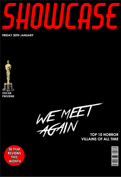
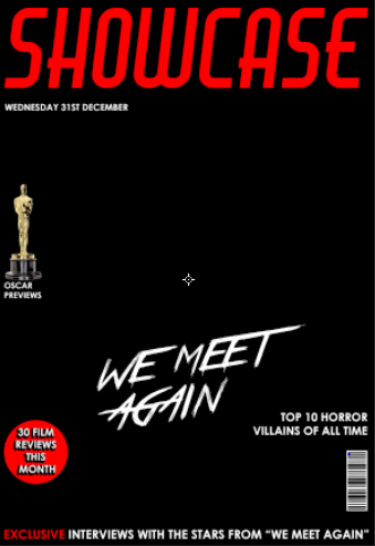
Here are some screenshots of my magazine so far, I have used photoshop and designed my own magazine cover, with the fonts that I previously posted about, as well as the coverlines that I said I am going to use. The pictures show where I started to what I have so far which is not far from a full cover. I have stuck to a basic colour scheme which connotate the horror genre that I am going for.
Research and planning: latest magazine draft
Because I am getting to the stage where I am ready to design my magazine in Photoshop I decided to draw an up to date version of my magazine and what I want it to look like
Research and planning: new location recce due to new location
Here is a new location recce with minor changes made to it due to us changing our location to Hyde Park.
Research and planning: changes to the villain
Since going to find a costume for the villain which was initially going to be a female dressed in an old victorian gown we changed our mind and decided to have a male character dressed as a clown. We did this because we thought that the clown outfit would fit closely with stereotypes and people not liking clowns, especially the idea of a clown at the end of your bed which is a shot in our trailer. Also the clown allows us to do more with make up and have scary features shown through the make up.
Research and planning: pan shots of location
Here are some videos of the location, the first shows where the friends will be walking through, it will be quite a creepy setting. The second shows the building that they pass and the grass that they will sit on at the beginning.
Research and planning: photos of location
Here is a link to my an album of pictures I uploaded to Flickr to show the location,
https://www.flickr.com/photos/130153071@N08/sets/72157650355624086/
This post shows our location which is Hyde Park, we took pictures to get an idea of where we can film certain aspects of our trailer, for example the group could be sat on the bench. We now also decided that we will have a shot of the group walking out of the gates into the street, which will then fade into the morning.
Thursday, 15 January 2015
Research and planning: new location
As a group we have decided to change the location of our trailer, rather than filming at Reddish Vale. We decided this because it is more convenient for ourselves and the actors but is also a similar environment where it will look like a horror.
Research and planning: actor release forms
These are our actor release forms, we have now found 4 actors to fill the spaces we need, 2 females and 1 male. They're called Hayden, Aelish and Sadia.
Sunday, 4 January 2015
Research and planning: poster fonts
Here I have chose some fonts from online that I plan to choose from to use for my film poster, I have chose some that look scary to represent the genre that my film is. At the bottom I have included a possible masthead for my magazine cover. I included this here because some font on the poster has to be in a bold font too. After researching film posters I found that at the bottom they include the credits and they use the "steel tongs" font.
Research and planning: magazine fonts
These are examples of fonts that I found online that could possibly be used as the masthead of my magazine. I chose all Sans Serif fonts because after research I found that they are what are used on magazines. They're more informal which is suitable with a film magazine.
Research and planning:character profile of the villain
This is a prezi showing a character profile of the villain in my film trailer.
Research and planning: magazine drawn draft 2
Here is my second magazine drawn draft showing the ideas that I currently have for my poster and where I could potentially take it.
Research and planning: film magazine drawn draft 1
This is a draft of what my magazine could look like, it is a starting point showing where I would place all of the key elements. I have the film title across the middle, the masthead large at the top, the strap across the bottom and the cover lines. I have done this to get an idea of where I want to go with the magazine and show my progress.
Saturday, 3 January 2015
Research and planning: weekly plan
Over the Christmas break I have had slow progress with my blog, so this is my plan for the week to make sure that I do not fall behind.
- Character profiles
- Script ideas
- Digital production logo
- Test shots
- Auditions
- Podcast
Research and planning: animatic storyboard
This is my animatic storyboard that I did with my group, we did this for a few reasons. To practice editing skills, to see how our trailer could potentially feel.
Subscribe to:
Comments (Atom)


